In my last post about Buster I explained how I devised a little Python script that tracks the number of RC Bugs in Debian’s current Testing distribution as a rudimentary way of tracking the progress of the Freeze process. I also mentioned that I’ve been running it (for a couple of months at the time of writing) and posting the results to twitter.
What I did not mention in that post is what I’ve done with it since then, so I decided it was time to cook up a little update to what it has been up to.
This little bot is also my way of learning Python, so it actually serves a double purpose. It works as a (hopefully) useful tool to those people interested in Buster’s release, but it also works as a case study for me, since I’ve been learning all sorts of ins and outs of Python thanks to it.
When numbers are not enough
When I started running the bot I had the presence of mind of actually logging the result to a file. It was intended as a troubleshooting measure, but it ended up giving me ideas.
I’ve recently started using Python to process images and it dawned on me that I could use that to actually implement a better way to visualize the progress of the Freeze for Buster. Being a Physicist by training, obviously I thought of doing that through a plot: the number of bugs versus time.
And so merrily I went into w3schools.com, digging around the documentation for matplotlib and pyplot. Only to find out the hard way that plotting things with dates in Python can be a huge pain in the ass.
See, back when I started learning to code we used C.
We all used C back then.
Because why use anything else? Right?
Strong vs weak typing, or, learning to expect the unexpected
So, I learned to code with C. And to this day I still keep some habits and idiosyncrasies of being a C programmer. Which is fine, I’m well at home with C and (fortunately) several languages are “C-like”, including Python.
But, unlike C, Python does not have strong typing. For a bit there I thought the huge mess that is trying to mix and match numpy, matplotlib, datetime et al would end up driving me insane, but I succeeded. Right now you may be wondering, “why did he have such a hard time? that’s really easy!”. Well, it is if you already know how to handle them.
For me, a self-teaching, strong-typing-expecting, reinvent-the-wheel-every-damn-time C programmer, it wasn’t.
The first plot
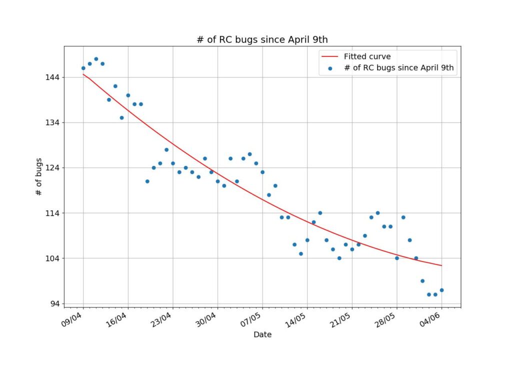
Anyway, after a bit of digging around I discovered stuff like MonthLocator and DateFormatter, and I got around to reaching this:

The very first plot (now lost to time) actually had a few problems with the labels on the X axis. A little trick made it always show a multiple of 7 days.
Using np.polyfit I adjusted a quadratic equation to the data and calculated its roots (if they existed). Assuming at least one root existed, I could find an estimate for when the number of RC bugs would reach zero. That meant a release estimate for Buster.
Refining the analysis
That’s all fine and well. Not brilliant work but marginally useful at least, and that’s cool with me. I’m not coding solutions for imaging a black hole, mind you.
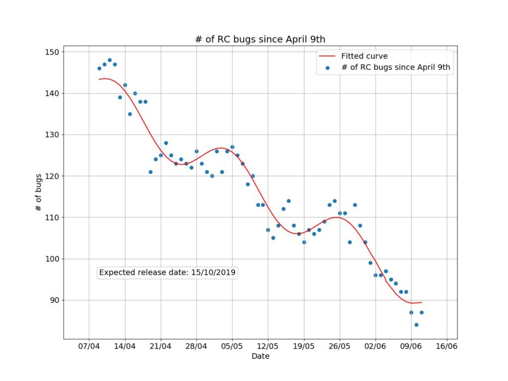
But, looking at the curve along with the data, I couldn’t help but feel a little disgruntled. That’s something I had noticed before from the numbers coming from UDD: they oscillate a bit. I could even estimate a “wavelength” of about three weeks in there. That’s probably related to the workflow of the release team, and to how bugfixes make it into testing.
Looking at the docs for polyfit, though, it was clear I’d have to find a solution elsewhere if I wanted something a little more complicated than a polynomial. So I turned to scipy‘s optimize.
All in all, it turned out that using a sine function made the quadratic coefficient unnecessary (it always converged to zero), so I discarded it. Naturally, I had to find another way to find the zero of the fitted function, since just using Bhāskara’s formula simply would not do. The answer came from optimize itself, naturally: fsolve.
Having had a little more time to come to terms with how dates work in Python, I improved the plotting code as well. Now it relies less on empirical guesses and more on objective properties of the data (which is better). The end result is this (that’s today’s plot, by the way):

A much better fit! For those of you that care, the reduced chi squared for today’s plot was around 10, which is not ideal but is acceptable. And, using fsolve’s solution, now we have an estimate for Buster release: October 15th.
By the way, the code for this bot is now on gitlab. If you’re curious about the code, or if you have anything to contribute, feel free to clone it.
Here comes Buster
Keep in mind that all of this is purely speculative. In fact, I feel like I owe an apology to the good fellows at the Release Team. By working on this bot it feels like I’m putting pressure on them for an earlier release. That is simply not the case. One of the great things in Debian is that it releases when it’s ready to release, and not a moment sooner. I want it to keep being that way.
The best thing anyone can do to help the release happen sooner is to join the bug squashing efforts. The release page is the best place to get started on them. Happy hunting!


Leave a Reply