A little more than a year ago, I published a series of posts talking about Debian’s release cycle, which was followed by an exercise in how a small python script could be used to track the number of bugs related to it.
That exercise had multiple objectives, but its main purpose was teaching myself about Python, APIs, JSON and so on. At the end of that exercise I had a little bot hosted in a free service online that kept track of the number of RC bugs in the Testing release. As I explained in one of those posts, the Release Team uses the number of RC bugs as one of the criteria to plan the Stable release. It’s not an objective measure, and at some point they make the call and “deal” with any bugs that are left. As an example, this tweet is from eve of Buster’s release day:
64 packages with RC bugs in Testing as of today. 0 days until the planned date for Buster’s release. Plan your party! pic.twitter.com/TWumGMRRr7
— Debian Tracker (@debian_tracker) July 5, 2019
They make the call based on what exactly the still-open bugs are. Packages related to them can go two ways. The Release Team can choose to allow them into Stable even though the bugs are not yet closed (if the bug is not particularly bad) or they can decide to remove them from the release, which means that that particular package won’t be a part of Stable.
And that was that. Buster had been released, and I saw no immediate use in keeping it running. I still kept the bot running, but did not post anything to Twitter directly; instead, I just retweeted some marginally related things I saw on occasion.
No plan is future-proof
Back then I didn’t really plan ahead for future releases, but in the back of my mind I knew I might come back to it when the time seemed right. So earlier this year, as Buster’s one year anniversary approached, I decided to get back to work on it. I did a quick review in the code, replacing dates where needed and updating release names. And so the Debian Tracker was back:
Yesterday was Buster’s 1 year anniversary. The freeze is supposed to start early next year (https://t.co/2EJmFI2FaE), so we’re gonna resume tracking the count of RC bugs, starting today. We’ll be looking into ways of improving tracking and reporting.
— Debian Tracker (@debian_tracker) July 10, 2020
First thing to do was clear everything. This bot (for now) doesn’t use anything sophisticate to store data, so it was just a matter of clearing the text files containing data collected before. Then, I rescheduled the task at PythonAnywhere and it got to work on July 10.
New doesn’t mean better, but it should
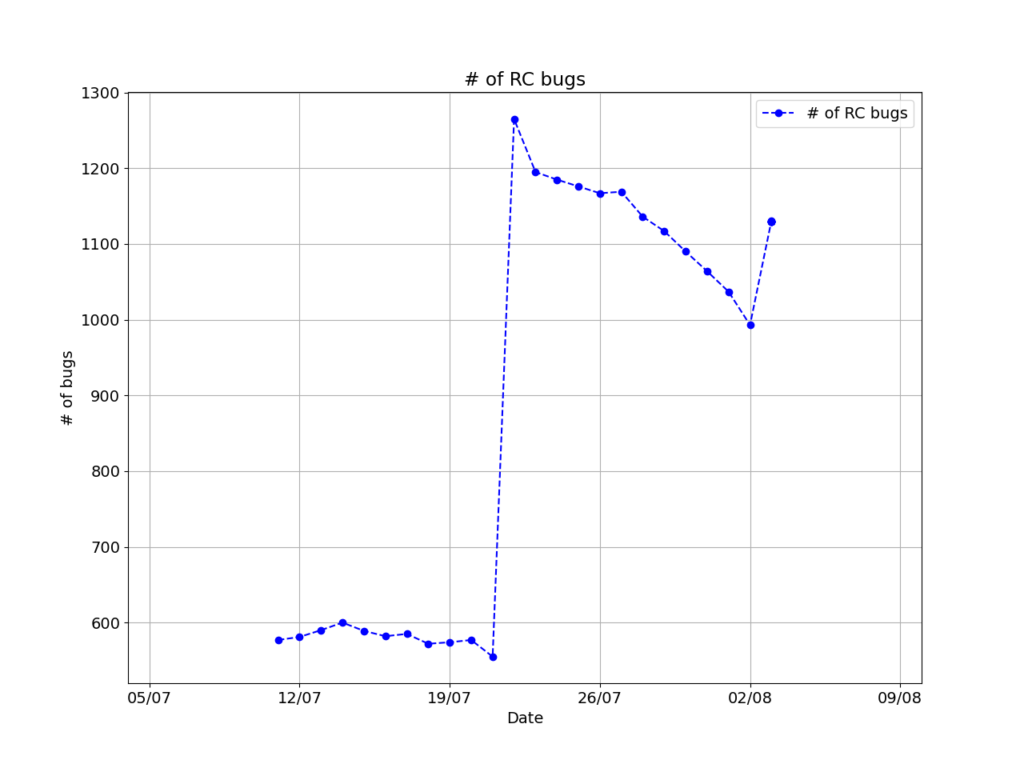
Now that the bot was back at work, I could think of ways to improve it. First thing, of course, would be reactivate the code that generates the plot showing the number of bugs with time. That would require some waiting, since a plot of few points doesn’t look that good. The first tweet including such a graph was on Aug 3:

That huge increase in the number of RC bugs is something I haven’t found an answer for just yet; it more than doubled overnight! At first I wondered if it has anything to do with Python 2’s end of life, but that’s just too many packages. A better possibility is the switch to gcc 10 as default compiler; I have seen it cause a lot of errors in Debian’s package generation systems (something I want to get back to in a future post).
I also updated the line style of the graph; a simple curve fit is no longer possible since this curve is more complicated than before. As we get closer to launch (most likely after the Freeze begins) it might get predictable enough for that to be viable again.
I have a big problem with that plot: old code generated it. I’ve learned a bit more about Python since one year ago and I wanted to update things. So, that’s what I did.
One particular bug that took me a while to find and fix was that the plot was always one day behind the actual data; I realized that mid-July, thanks to that big spike. Took me a bit to figure out that I was not updating the data arrays at all; Although I got data from UDD and saved it to the text files, I was not updating the data arrays that keep the data being read from those files.
“Cut off one head, two more shall take its place”
Fixing that particular bug got me into a whole world of pain as things started to break down from there; fixing that particular bug involved splitting up functions, which means variables were suddenly unavailable since scope had changed.
Eventually I will convert the whole bot to an Object Oriented paradigm. That’s something I’m going to work on in a separate branch. I don’t want to mess with what’s already working. Besides, I might take a while converting it, since I’m not exactly experienced in OOP. But, then again, this is a learning exercise more than anything.
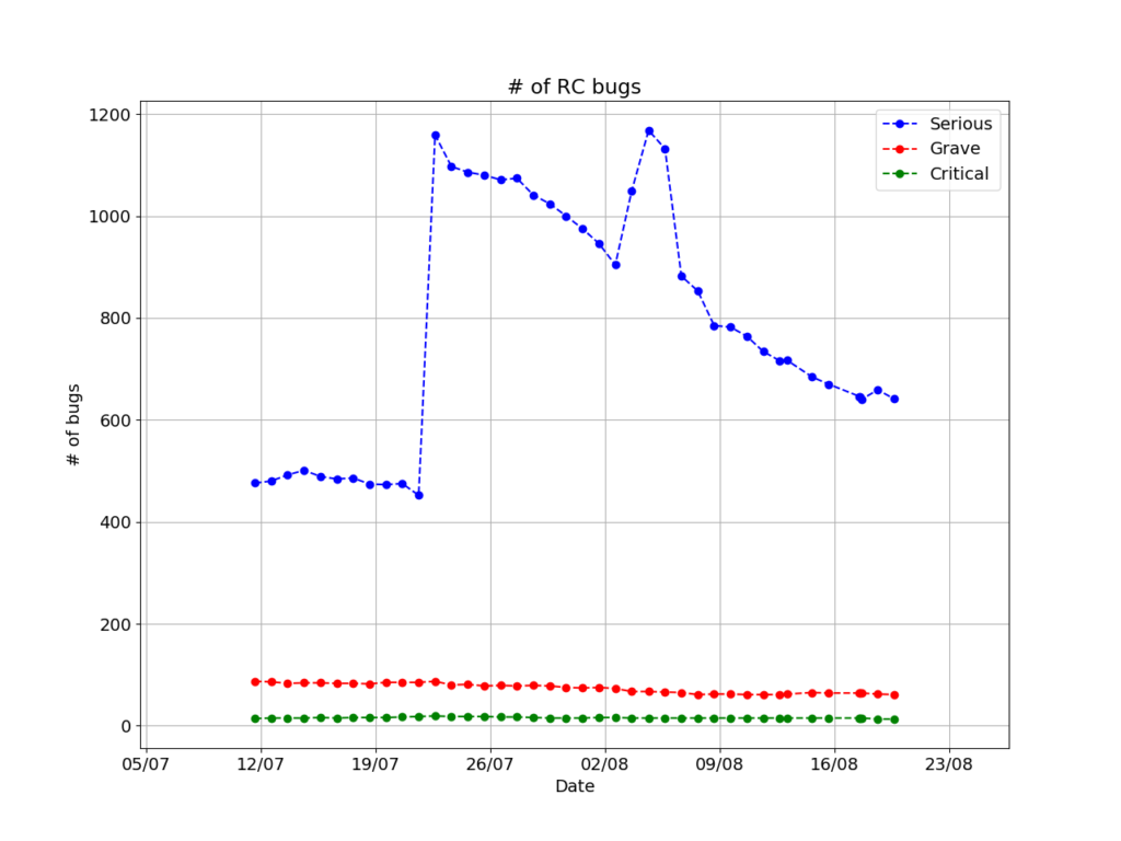
Another improvement to the code was the fact that it now makes a distinction of the severity of bugs. Instead of a single line with the total number, it shows three lines, showing numbers for serious, grave and critical bugs. I figured that the number of the bugs is not that important, and it’s already on the tweet. Moreover, this conveys more information, so that’s a net positive.
Zeno’s workflow
This is not over yet (is it ever?). One thing I noticed when I looked at the graph the bot generated in late 2019 was that the X axis was a mess. The code that generates labels is a mess and does not work well with extended periods of time. That’s something that need fixing before it becomes an issue. It’s next in my TO-DO list.

The above is the latest figure, at the time of writing. For now, I feel satisfied with how it looks, but any suggestions would be very welcome.
For now, this is it. I wanted to show some code here, but in the end that didn’t feel necessary. If you’re interested, I’m keeping it on salsa. You’re free to have a look since it’s under the MIT license (the same as twitterbot_framework, upon which I based it). You can have a look here.


Leave a Reply